Adobe Photoshop Camera
Overview
While the app has the word camera in the name, a more fitting name might be Adobe Filters. This app is jam-packed with installed and ready to install filters, which Adobe calls lenses. While it’s true that you can use the app’s built-in camera functionality, that might not be everyone’s preference, more about that later. The app also provides the capability of adding effects to saved existing photos. I get the impression that Adobe’s target market for Photoshop Camera is users of Snapchat and Instagram. Users that want to go beyond the included lenses and tools in those apps are the primary target. That’s not to say other users might not also be interested in some of what’s available too. I think it’s safe to say there is something for everyone here, though many of us may not be using it every day or on our vacations. Almost everything is included with the app right now; the only in-app purchase is additional online storage for your photos using Creative Cloud.
Lenses
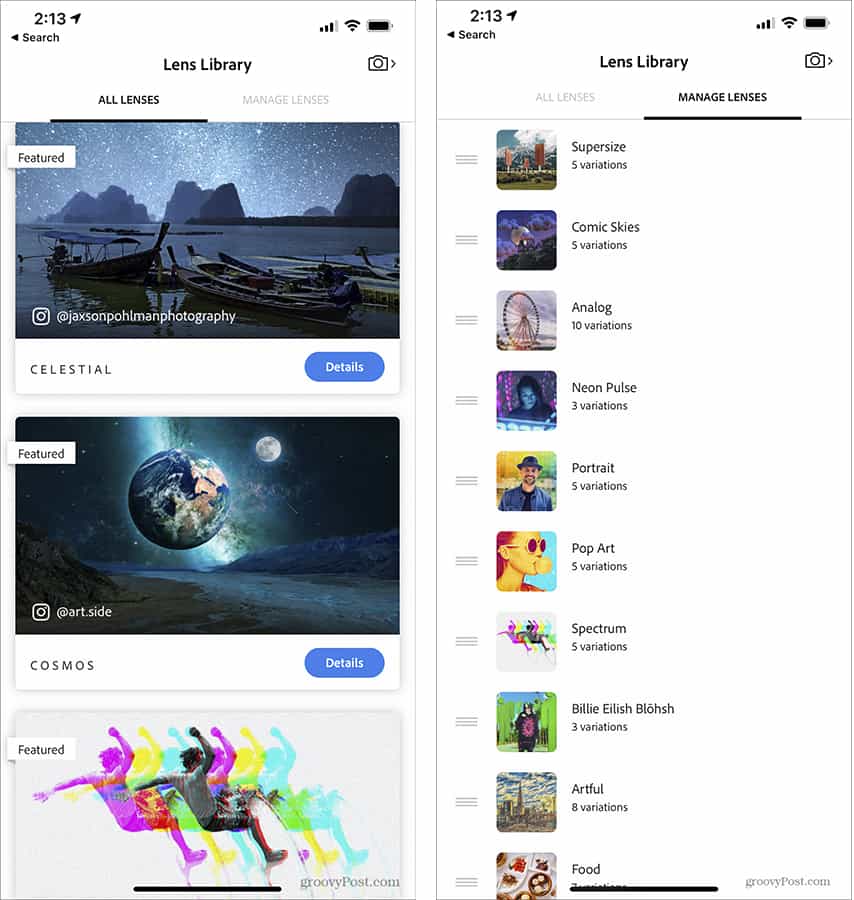
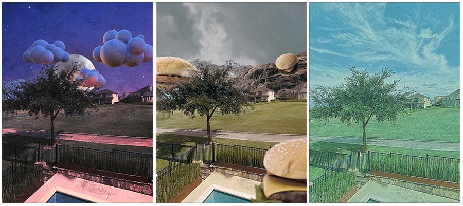
When you start the app for the first time, several of the many available lenses are already installed. You can choose to install or uninstall whichever lenses you like. You can also choose the order that the lenses appear in at the bottom of the camera display. Adobe promises there are many more lenses that will be available to download for free. As of this writing, there are 28 available lenses. These cover a wide variety of uses and styles. Things like Comic Skies, Spectrum, Cosmos, Supersize, Artful, and Reverie, just to name a few. Some of these can be far out there. While Studio Light, Vibrant, Portrait, Analog, and Blue Skies can be creative, useful, and less over the top. Within each lens type, there are multiple options to tailor the results to your preference or the scene you are shooting.
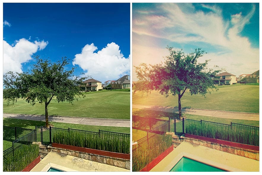
Everyone has different tastes when it comes to creativity and photography. In my years as a professional photographer, I have developed a creative style without using much manipulation or many filters. I’m not sure how many users will want giant hamburgers, ice pops, or chickens in their landscapes, but that’s not me. I can see the definite utility in things like Blue Skies, which is a quick way to replace a bald sky with a selection of blue skies with clouds. Analog has some promise for bringing back that old-timey film look. There is something here for everyone, including old pros like myself.
Camera
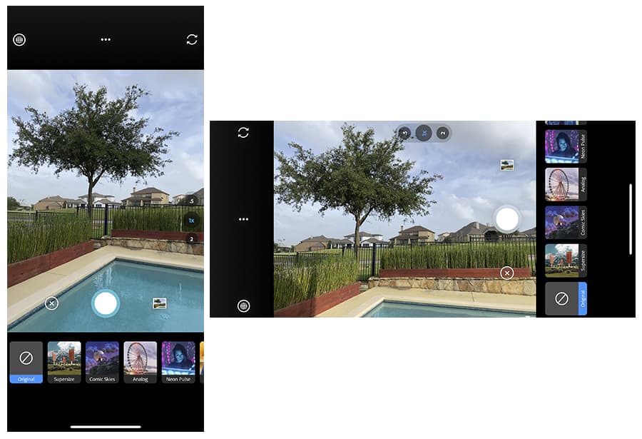
The camera built into Photoshop Camera won’t soon replace the phone’s included camera app, nor does it come close to the functionality of Camera+ or many of the plethora of other advanced photography apps. That’s not the purpose of the app, but when you have Photoshop in the name, users could expect much more than what is essentially a filter app. A couple of camera annoyances quickly become evident. The camera always launches in selfie mode, and I couldn’t find a way to change that default. Also, switching camera orientation makes for some very awkward controls. For instance, when swiping through the options for a lens, if the camera is oriented vertically (portrait), you flip left to right. But if the camera is oriented horizontally (landscape), you’d be flipping top to bottom, which is very awkward. The zoom scale is along the right side when shooting vertically, but when you turn the camera to shoot horizontally, it doesn’t move. What you end up with is a zoom scale across the top with the numbers turned sideways. Adobe, why not have the numbers change orientation depending on which way I’m shooting?
In most cases, I’d prefer to shoot my photos using my camera app of choice and then playing with the Photoshop Camera effects on my unadulterated original image. This methodology affords the benefit of not taking a chance of missing the shot I want while I mess with the many different effect options.
Critique
The use of Photoshop in the name will undoubtedly attract some users, but this app has little to do with Photoshop, and the cynic in me thinks Adobe is just using the name to gain users. Most people associate Photoshop with a feature-rich application; this is certainly not that. Adobe has made some, in my opinion, questionable choices in the design of Photoshop Camera: Where’s the crop selector? I tapped the little editing button, and it brought up controls for shadows, highlights, and the like. There’s also a button for the Magic Wand, and one to launch Adobe Photoshop Express if it’s available on your phone. Still, no cropping control evident. I decided to see what happens when I hit the save button on the bottom right side of the screen while a photo I was working on was displayed. Instead of saving the image to my camera roll as expected, it brought up a selection of pre-configured crops as well as a Freeform choice, which allows cropping however you like. That’s not intuitive at all.
Conclusion
I do recognize that this is the first version of the app, and I’m hoping it will evolve, and I have confidence that Adobe will refine and polish the interface. I’m also looking forward to seeing what new lenses Adobe will add over time. I believe Instagram and Snapchat users will be very pleased. I also think there may be better choices for more serious photography needs. But serious photographers may want to give it a try and play with some of the effects.
![]()
